 We look at how the best way to present data will vary depending on your audience.
With the wealth of health data now available, it’s vital to present it in a way that chimes with the healthcare professionals making important decisions on how services are delivered. The ‘holy grail’ is a compelling narrative told in the simplest way possible. Having data is one thing, but if you can’t utilise it to make decisions, or even make sense of it, it has limited value – this is where effective data visualisation comes into play.
Data visualisation refers to the techniques used to communicate data or information by encoding it as visual objects (points, lines or bars) contained in graphics, also commonly referred to as dashboards.
At ICHP we’ve found that being collaborative and iterative in our approach to creating effective visualisations, by discussing stakeholder requirements with them and working through the options, has always been key to our success. Research also supports gathering diverse points of view and trying out as many visual approaches as possible before homing in on one and refining it.
We work closely with independent Tableau software expert Steve Adams, who says: “Understanding your audience and how they will consume information is one important consideration when designing data products and visualisations. Knowing your audience’s data literacy and experiences and balancing that with visualisations to enable insights quickly, without misleading, can be a challenge.
“Data visualisation tools are getting better and easier to use, but this often leads to reports and dashboards becoming cluttered with overly complex charts. This can lead to users not engaging with a discovery dashboard or not trusting the message that the author reports.”
Four key questions for effective visualisations
At ICHP we ask four questions that are key to any visualisation we build – does it engage the end user; can they understand it straight away; does it provide the intended narrative; and does it make a positive impact?
Take, for example, primary care networks (PCNs). These groups of GP practices are a key part of the NHS long term plan, and each typically covers 30,000-50,000 patients. The networks provide the structure and funding for services to be developed locally, in response to the needs of the patients they serve.
PCNs will eventually be required to deliver a set of seven national service specifications. They will also be expected to think about the wider health of their population, taking a proactive approach to managing population health.
To deliver on both requirements they need to have access to data about their activity levels and their local population’s needs in formats that are easy to understand and use. For example, if a primary care network wants to investigate “what’s driving our unplanned activity?” you could use a bubble chart or a bar chart (as below).
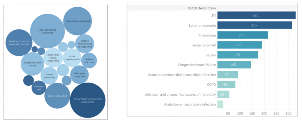
The two charts contain the same data and you could argue that the bubble chart is more appealing. However, it takes much more effort to answer the original question using the bubbles than when looking at the bar chart – not ideal for busy GPs under time pressure.
We believe the best visualisations take complex data and present it in a simple way. If the user can’t answer their question in the first few seconds then there’s a risk the visualisation won’t be used.
But should you always keep it simple?
Just because we have amazing data, we don’t need to show it all on one visualisation. We think carefully about each chart and the impact that it has on the overall objective. While we aim to present information in a simple way, sometimes a bar chart or similar just isn’t enough to give a full picture behind the data being presented.
Without more complex visualisation, detecting the inefficiencies hidden in the patterns and anomalies in data would be an impossible slog. More interactive visualisations that enable users to drill down into the data can allow for greater exploration of an issue. For example a dashboard that covers total hospital spells could then drill down to types of spell, types of spell by age and so on, to give more clarity on how pathways are working for different patient groups.
ICHP has the expertise to create more complex visualisation where needed, such as statistical process control (SPC) charts. These are analytical tools used to monitor performance and show unwarranted variation. For example, they can be used to monitor condition management, measure KPIs such as hospital admissions or track the progress of initiatives such as a new intervention. They define what is in range, what is an outlier and what is a shift using control limits and colours on monthly data points. This allows organisations such as PCNs to see more easily areas they need to address together and to check whether any individual practice is seeing different results to others in the network.

At ICHP we have access to great data, expertise in understanding data and in-house capabilities to create the right visualisations to meet each audience’s specific needs. Our NHS and industry partners ask us to create visualisations from multiple data sources for a range of different audiences; however, the process of building them is consistent:
Question > Data > Narrative > Design & Build > Test> Implement
A final piece of advice from Steve Adams: “The human brain is tuned to recognise patterns. If you are reporting insights on a regular basis, it is a good idea to deliver your reports in a consistent way so that repeat readers can increase their speed to insight and decision making.”
By Julia Wilkins, ICHP Head of Data & Analytics.
Steve Adams is a visual analytics consultant, a Certified Consultant of the International Business Communications Standards (www.ibcs.com) and a Tableau trainer.


")